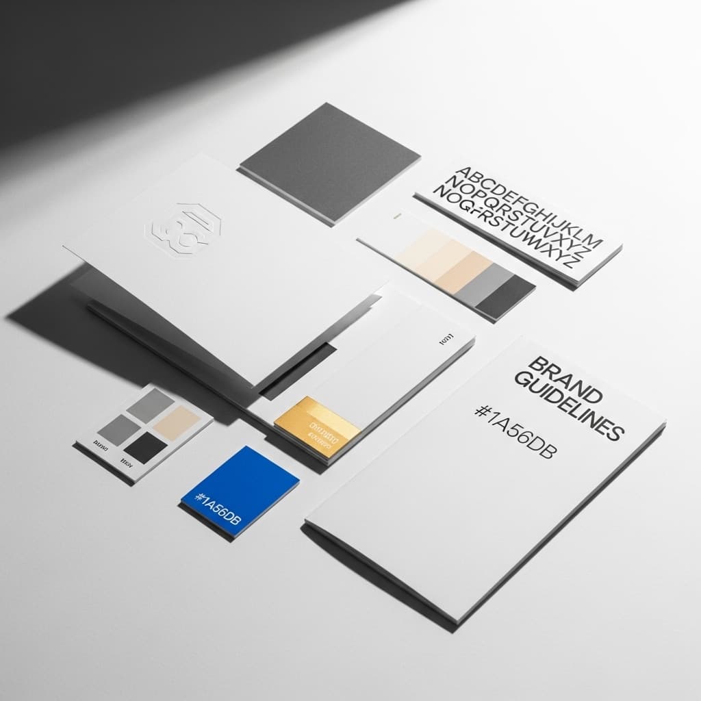
The Psychology of Color in Brand Identity
Color shapes brand trust and recognition before a word is read. Here's what the research really says about color psychology, and why it matters.
In briefColor isn't a minor aesthetic choice, it's one of the fastest, highest-leverage decisions in brand identity, shaping recognition, trust, and purchase behavior before anyone reads a word about the brand.
The Psychology of Color in Brand Identity: Why This Decision Matters More Than You Think
Of all the decisions involved in building a brand identity, color is consistently treated as the least strategic. It gets chosen quickly, often based on personal preference, and revisited far less rigorously than logo design, messaging, or website copy.
The research on how color actually functions suggests this ordering is backwards.
Color Is Processed Before Language Is
Color doesn’t require interpretation the way words do. It produces an emotional, perceptual reaction almost immediately, even before someone has consciously registered what a brand does or says about itself.
Research consistently shows that a large majority of snap judgments people make about a product or brand, commonly cited around 90%, are based on color alone, often within the first moments of exposure.
Color is also one of the strongest drivers of brand recognition, with consistent color use increasing recognition by as much as 80%. Before a visitor reads your headline, before they scroll to your product, before they form any conscious opinion about your business, color has already spoken.
Why Color Outlasts Almost Everything Else in Memory
One of the more striking findings in color psychology research is that people retain color associations with a brand far longer than they retain the brand’s actual name. Across multiple studies, brand color recall remains significantly higher than unaided name recall over extended periods, often by a wide margin.
In practical terms: the color of your brand may be doing more long-term memory work than your name. That’s a meaningful finding for any founder deciding where to invest strategic attention during brand development, and a strong argument against treating color selection as a quick, low-stakes decision.
This pattern holds in purchase behavior too! Color is repeatedly identified as one of the primary factors in a consumer’s decision to buy, and in many studies, ahead of price or product features. The specific numbers vary by source, but the direction is remarkably consistent: color is not a downstream aesthetic choice. It’s one of the primary inputs shaping trust, recognition, and purchase behavior.
What Different Colors Tend to Signal
Color associations are not universal laws, but there are well-documented, consistently observed patterns:
- Blue: means trust, stability, competence. Dominant across finance and technology, where credibility is the primary emotional register a brand needs to establish.
- Red: means urgency, excitement, appetite stimulation. Common in fast food branding and time-limited sales messaging, where the goal is fast action rather than considered trust.
- Green: means growth, health, sustainability. A frequent choice for wellness and environmentally-positioned brands.
The more important finding, however, is that these associations are heavily moderated by context. A widely cited academic study on brand-color relationships found that the perceived appropriateness of a color for a specific brand and industry matters more than the psychological properties of the color in isolation.
The real question is never “what does blue mean?” It’s “does blue make sense for what this brand is, and who it’s trying to reach?” A color that builds trust in financial services might feel sterile or disengaged for a children’s brand. The psychology is real, but it works relationally, not as a fixed universal code.
Color and Conversion: What the Data Actually Supports
Beyond recognition and recall, color has a measurable impact on conversion behavior, particularly around calls-to-action. This is where the research gets more contested. There is no single “best” CTA color that outperforms all others in every context.
What the research agrees on far more consistently: contrast matters more than any specific hue. A CTA button that stands visually apart from its surrounding design will generally outperform one that blends into an established color field, regardless of whether that button is red, green, orange, or blue.
This nuance often gets lost in popular coverage of color psychology, which tends to present isolated statistics like, “red buttons convert X% better”, without the context that surrounding design and existing brand palette heavily influence the result.
The more reliable takeaway is that, color decisions should be evaluated as part of a full brand system, not selected in isolation based on a single decontextualized statistic.
Why This Decision Gets Underinvested In
The reason color receives so little strategic attention relative to its actual impact is structural, not a failure of awareness. Color decisions are fast to make and slow to show their cost. A founder can select a color palette in an afternoon and feel no immediate consequence.
The cost, in recognition, in emotional resonance, in conversion, doesn’t surface for months, by which point the color is entrenched across every touchpoint the business has built. Correcting course later is expensive! Getting it right from the outset costs nothing beyond the time and thought required upfront.
What This Means for Your Brand
Color should be treated as a strategic decision made in service of one specific question: what do we want someone to feel about this brand in the moment before they’ve read anything about it?
Answering that well requires understanding your audience, the emotional register your brand needs to occupy, and how you need to be perceived relative to competitors in your category, not simply which color looks appealing in isolation.
Once established, color needs to be applied with strict consistency across every touchpoint; website, packaging, social presence, physical materials, because the recognition and recall benefits documented in the research depend entirely on repeated, consistent exposure. A color used inconsistently forfeits most of the advantage color strategy is capable of producing.
Color is not a preliminary decision to move past quickly on the way to “the real branding work.” It is one of the highest-leverage, fastest-acting, and longest-lasting decisions in the entire process.
The Coast is a brand design studio building visual identities with intention, down to the color. If your brand’s colors aren’t doing the work they should be, let’s fix that.
Let's create something remarkable together.