Why Visual Consistency Is Your Brand’s Most Powerful Asset in 2026
In an era of fragmented attention, AI-generated content, and infinite digital touch points, the brands that win are the ones audiences can recognize in an instant.
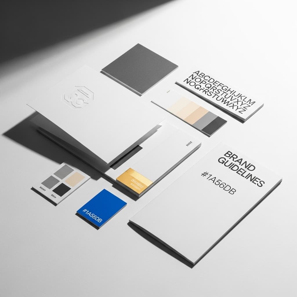
In briefVisual consistency means using the same colours, fonts, and imagery style across every touchpoint so your brand is recognisable without a logo. In 2026, when content volume is highest, the brands that win are the ones customers can identify in a half-second scroll.
Picture this: a customer scrolls through their Instagram feed at 11 p.m. In the space of three seconds, they encounter your brand’s ad. They’ve never consciously noticed your name before — but something feels familiar. The color. The font. The way the image is composed. Without reading a single word, a feeling is already forming.
That’s not luck. That’s the result of intentional, sustained visual consistency— and in 2026, it’s no longer a “nice to have.” It’s the single most reliable lever brands can pull to build recognition, trust, and revenue in a noisy, fragmented digital world.
In this post, we’ll unpack what visual consistency actually means, why it matters more than ever, and how leading brands are using it as a competitive weapon.
What Is Visual Consistency? (And What It Isn’t)
Visual consistency is the practice of using the samecolors, typography, imagery style, logo usage, spacing, and tone of designacross every customer touchpoint — from your website and social media to packaging, email campaigns, and in-store signage.
But let’s be clear about what it isn’t: visual consistency is not rigidity. It doesn’t mean every piece of content looks identical. It means every piece of content feels like it belongs to the same family.
“
Visual consistency is not the enemy of creativity — it is the canvas on which creativity becomes meaningful.
— Debbie Millman, Brand Strategist
Think of it as the difference between a jazz ensemble and a random collection of musicians. Each player has their own style and solos, but they’re all playing the same song, in the same key, with the same rhythm. The result is harmony — not monotony.
The 2026 Landscape: Why This Matters More Than Ever
The average person encounters between 6,000 and 10,000 brand messages per day.With the explosion of AI-generated content, short-form video, and omnichannel marketing, that number is only growing. Consumers are overloaded — and their brains have evolved an efficient response: pattern recognition.
Your brand’s visual identity is a pattern. Every time it appears consistently, you’re reinforcing that pattern in your audience’s memory. Every time it appears inconsistently, you’re actively eroding it.
Three Forces Making Visual Consistency Critical in 2026
1. The AI Content Flood— Generative AI has made it trivially easy to produce content at scale. The result is a near-infinite stream of visually generic material flooding every platform. Brands with a distinctive, consistent visual language cut through the noise by being recognizable, not just high-volume.
2. Fragmented Attention Spans— Studies show the average time a user spends looking at a social media post is now under 1.7 seconds. You don’t have time to explain who you are. Your visuals need to do it instantly.
3. The Trust Economy— Post-pandemic consumer psychology has shifted dramatically toward trust-based purchasing. Visual inconsistency signals internal disorganization and erodes the sense of reliability that drives purchase decisions.
3.5×more brand recall for companies with consistent visual identity vs. those without (Lucidpress, 2025)
23%average revenue increase attributed to consistent brand presentation across all channels (Forbes / McKinsey Analysis)
The Psychology Behind the Pattern: Why Our Brains Love Consistency
To understand why visual consistency is so powerful, you need to understand a bit of cognitive science.
The human brain uses a mental shortcut called the mere exposure effect— a well-documented psychological phenomenon where people develop a preference for things simply because they’ve seen them before. The more familiar something feels, the more trustworthy and likeable it appears.
Every consistent visual impression you make reinforces familiarity. Familiarity builds affinity. Affinity drives conversion. It’s not complicated — but it is easy to get wrong when teams move fast or scale quickly.
“
Consistency is the foundation of trust. And trust is the foundation of every purchase decision ever made.
— Seth Godin, Author & Marketing Thought Leader
There’s also the concept of cognitive fluency— the ease with which the brain processes information. Visually consistent brands are easier to process. Easier to process means more pleasant to engage with. More pleasant to engage with means longer session times, higher recall, and more positive brand associations.
The Six Pillars of Visual Consistency
A truly consistent brand identity isn’t built on one element. It’s the coherent combination of multiple visual signals working together. Here are the six non-negotiables:
- 01. Logo System Clear standards for all logo variations, sizing, spacing, and forbidden uses. Your logo is your visual handshake.
- 02. Color Palette A precise color palette — typically 2–3 primary colors and 2–3 secondary — applied with exact HEX, RGB, and CMYK codes across every medium.
- 03. Typography A defined type hierarchy: one or two typefaces maximum, with clear rules for headings, body copy, captions, and display text.
- 04. Imagery Style A consistent photographic and illustrative style: lighting, composition, subject matter, and mood. This is the element most brands overlook.
- 05. Layout & Spacing Consistent spacing, grid systems, and proportional relationships between elements. White space is a brand decision too.
- 06. Visual Tone The ‘voice’ of your design: whether formal and minimal, warm and playful, or bold and editorial. Every design decision should reflect a coherent personality.
These six pillars should be documented in a living brand style guide— not a PDF that gets buried in a Google Drive folder, but an actively maintained, accessible reference that every designer, marketer, and partner uses daily.
What Inconsistency Actually Costs You
Let’s talk about the business case, because the cost of inconsistency is rarely calculated — but it’s very real.
Brand confusion = lost revenue.When a customer sees your website, then your Instagram, then your email newsletter, and they feel like they’re looking at three different companies, they don’t just feel confused. They lose confidence. Confidence is the prerequisite to conversion.
Rework costs compound.Without clear visual standards, designers spend time recreating elements from scratch, arguing over decisions, and fixing inconsistencies in production. Estimates from the Design Management Institute suggest design-mature organizations — those with strong brand systems — spend up to 40% less on creative production than their less systematic peers.
Trust takes years to build and seconds to break.A single jarring visual inconsistency on a landing page, at a critical moment in the purchase journey, can spike bounce rates by double digits. A/B test data from multiple e-commerce studies consistently shows that brand cohesion positively correlates with conversion.
“
Your brand is a promise. Visual consistency is how you keep it, every single day, across every single touch point.
Brand Consistency in the Age of AI: New Challenges, New Opportunities
2026 has brought a specific new challenge to visual brand management: AI-generated content. As teams use tools like Midjourney, DALL·E, Adobe Firefly, and others to create imagery at scale, the risk of visual drift is higher than ever.
An AI image generator doesn’t know your brand guidelines. It produces beautiful, high-quality imagery — but without strict prompting and curation, that imagery will slowly pull your brand in multiple aesthetic directions simultaneously. The result is a visually incoherent feed that undermines the very consistency you’ve built.
How Forward-Thinking Brands Are Responding
- Creating detailed AI prompt libraries that encode brand visual DNA into reusable generation prompts
- Establishing AI output review checkpoints before content is published, against a visual consistency checklist
- Using tools like Adobe’s Brand Style Guide integrations and Figma’s Variables system to maintain consistency within AI-assisted workflows
- Training in-house teams and AI systems on their specific visual identity, not just general aesthetic preferences
The brands that treat AI as a tool within a defined visual system — rather than a replacement for one — are seeing the best of both worlds:scale without sacrifice of identity.
Case Study Snapshot: The Power of Getting It Right
Consider the contrast between two hypothetical DTC brands launching in the same market:
Brand A invests in a comprehensive visual identity system in their first month. Every social post, email, and ad uses the same three colors, the same typeface, and the same warm, editorial photography style. By month six, unprompted brand recall in their target demographic is 34%.
Brand B launches with a logo and a rough color palette, but no broader system. Their Instagram uses one aesthetic, their website another, and their email campaigns look like a third company entirely. By month six, unprompted recall is 9% — even though they’ve spent a similar budget on media.
Same market. Similar spend.3.7× the brand recall.The only meaningful difference? Visual consistency.
Building Your Visual Consistency System: A Practical Framework
If you’re starting from scratch, or cleaning up an inconsistent brand, here’s a practical sequence:
- Audit Your Current State— Collect 30–50 pieces of your brand content from the past 12 months across all channels. Lay them side by side. Identify what’s consistent and what isn’t. Be honest.
- Define Your Core Visual DNA— Work with a brand designer to codify your logo system, color palette, typography, and imagery direction into clear, specific rules — not vague principles.
- Build a Living Style Guide— Create an accessible, digital-first brand guidelines document. Tools like Notion, Zeroheight, or Frontify work well for keeping this alive and up to date.
- Establish a Creation + Review System— Every piece of outgoing content should be checked against the guidelines before publication. Build this into your workflow, not as a bottleneck, but as a quality gate.
- Train Your Team (and Your Partners)— Agencies, freelancers, and contractors need to understand your brand system just as well as your in-house designers. Include a brand onboarding module in your vendor process.
- Review and Evolve Annually— Brand guidelines should evolve as your brand matures. Schedule an annual visual audit and update cycle to keep the system current without losing its core consistency.
Final Thoughts: Consistency Is a Competitive Advantage
We’re living through a moment where attention is the scarcest resource, trust is the most valuable currency, and content is infinite. In this environment,the brands that win aren’t necessarily the loudest or the most creative — they’re the most recognizable.
Visual consistency is the engine of recognizability. It’s the quiet, compounding investment that makes every marketing dollar work harder, every content piece land stronger, and every customer interaction feel like a continuation of the same trusted story.
In 2026, it isn’t enough to have a great logo or a beautiful website. The brands that endure are the ones that show up — consistently, intentionally, and unmistakably — everywhere their audience looks.
“
A brand is not what you say it is. It’s what they see — every time, everywhere, without exception.
Let's create something remarkable together.