Building a brand identity requires more than picking colors. This 10-step framework reveals exactly how to design a brand identity from scratch, covering research, strategy, and visual systems to build a lasting business asset.

Designing a brand identity requires a strict sequence. First, align your internal stakeholders and research your audience and competitors. Second, define your strategic positioning and messaging architecture. Third, explore visual concepts through moodboards before designing your logo. Fourth, expand your system with typography, colors, and imagery. Finally, apply the system to real world touchpoints and document everything in a strict brand guidelines book so your identity remains consistent as you grow.
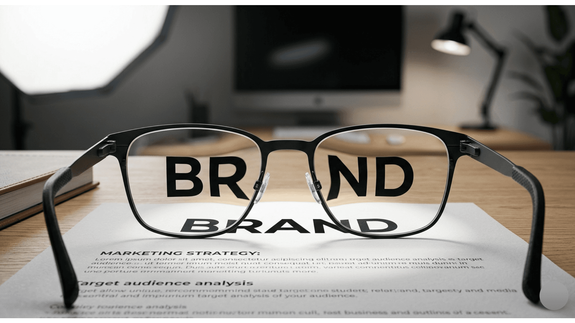
Learning how to design a brand identity from scratch is a common pursuit for founders and marketing leaders, but the vast majority of available advice skips the most critical components. Most guides jump straight to logo design and color palette selection, treating the visual output as the entire project. In reality, the visual elements are merely the surface layer of a much deeper business strategy.
Creating a cohesive and effective market presence requires a structured brand identity framework. Without this structure, you are simply decorating a business rather than positioning it for long term growth. Whether you are launching a new company or trying to systemize your current marketing efforts, building brand identity requires a methodical approach that connects your business goals directly to your visual execution.
At Coast, we rely on a rigorous 10 step process to ensure every visual decision is backed by data and strategy. This is the exact framework we use to build memorable brands for our clients, stripped of the industry jargon and laid out so you can apply it to your own business.
Step 1: Internal Stakeholder Alignment
Before you can define how the public perceives your company, you must understand how the leadership perceives it. Misalignment at the top is the number one reason branding projects fail. If the founder wants the brand to feel disruptive and edgy while the sales director wants it to feel safe and corporate, the resulting design will be a confused compromise.
Start by interviewing key stakeholders. Ask them to define the company mission, the core values, and the long term vision without using any business buzzwords. Document these answers and look for the common threads. The goal of this step is to establish a unified internal consensus that will serve as the anchor for every decision moving forward. If you want to understand the foundational beliefs that drive our own strategic recommendations, you can read more about our team and philosophy on our about page.
Step 2: Audience Profiling
A brand does not exist in a vacuum. It exists to serve a specific group of people. Many companies make the mistake of defining their audience by broad demographic data like age, gender, and income. While useful for media buying, demographics do not help you design a brand.
Instead, focus on psychographics. What are the deep frustrations of your ideal customer? What are their aspirations? What does a successful outcome look like for them after using your product? When building brand identity, you are essentially designing a persona that your ideal customer wants to align themselves with. A luxury fitness brand looks and sounds entirely different from a budget friendly community gym, not because of the equipment, but because of the psychographics of the people using it.
Step 3: Competitive Landscape Audit
You cannot effectively differentiate your business if you do not know what you are differentiating it from. A proper competitive audit goes far beyond simply looking at the logos of your top three competitors. You need to map out their messaging, their brand tone, their pricing strategy, and the specific visual cues they rely on.
Create a matrix that plots competitors on a scale from traditional to modern, and from serious to playful. This visual map will immediately highlight the white space in your market. If every single competitor uses blue and gray and communicates in a highly corporate tone, choosing a warm color palette and a conversational voice becomes a strategic decision, not just an aesthetic preference. This audit is equally vital if you are an established company looking to undergo a rebrand to escape an outdated market position.
Step 4: Brand Positioning
With internal alignment, audience insights, and competitive data in hand, you are ready to define your brand positioning. This is a single, concise statement that dictates exactly where your company sits in the market. It should define who you serve, what you offer, the specific benefit you provide, and the proof that you can deliver it.
Positioning is the most important step in this entire framework. If your positioning is generic, your visual identity will be generic. A strong positioning statement forces the design team to make specific choices. For example, a positioning statement that claims a company is "the most affordable option" will drive the visual team toward clean, efficient, and unpretentious design choices, whereas a "premium artisan" positioning will demand rich textures, bespoke typography, and a feeling of exclusivity.
Step 5: Messaging Architecture
Before any sketching begins, you must define how the brand speaks. Your messaging architecture translates your positioning into actual copy. This includes your primary value proposition, your supporting proof points, and your brand personality traits.
Create a list of three to five personality traits. Avoid generic words like "professional" or "friendly." Instead, use descriptive pairings like "bold but approachable" or "analytical yet empathetic." These traits act as a filter for your copywriters and your designers. If your brand is "bold but approachable," the designers know they can use heavy, striking typography, but they must balance it with ample white space and soft, inviting photography styles. If you are looking to see how we integrate messaging into our visual systems, you can view our dedicated brand identity process.
Step 6: Moodboarding and Concept Exploration
Now you enter the visual phase, but you must do it with restraint. The goal of moodboarding is not to collect pretty pictures. It is to test the personality traits you defined in the previous step.
Build two or three distinct moodboards. Each board should represent a different visual direction that still aligns with the strategy. One board might lean into geometric precision, while another explores organic, hand crafted textures. Use these boards to facilitate a conversation with stakeholders. Ask them which board feels right for the brand, and more importantly, ask them why. This prevents subjective feedback later in the process. When stakeholders understand that a specific texture was chosen because it communicates "authenticity," they are less likely to ask for a change based solely on personal color preferences.
Step 7: Logo and Mark Development
A logo is the distillation of your entire strategy into a single mark. This is where the actual design execution begins. The designer should take the chosen moodboard direction and begin exploring shapes, symbols, and typography that represent the core positioning.
During this step, it is crucial to explore the logo in context. A logo never exists in a white void. It exists on a website header, a social media profile, a business card, and sometimes a physical product. Sketch the logo in these environments early in the process to ensure it functions practically. The goal is to create a primary logo, a secondary logo for tight spaces, and a recognizable brand mark or icon that can stand on its own.
Step 8: Visual Identity Expansion
The logo is just the anchor. The real power of a brand identity framework lies in the expanded visual system. This step involves building out the foundational elements that will make your brand recognizable even when the logo is not visible.
Start with typography. Select a primary typeface for headlines and a secondary typeface for body copy. The typography should reflect the brand personality. A traditional financial institution might use a dignified serif font, while a disruptive tech startup might use a clean, geometric sans serif.
Next, build the color palette. Do not just pick colors you like. Choose colors based on psychology and contrast ratios. Ensure you have a primary color for dominance, a secondary color for accents, and a neutral palette for backgrounds and text.
Finally, define your photography, illustration, and iconography styles. Do you use bright, high contrast photography, or muted, editorial style images? Do your icons have rounded corners or sharp angles? Every single visual element must feel like it belongs to the same family.
Step 9: Touchpoint Application
A visual system is useless if it lives exclusively in a PDF document. You must apply the brand identity to real world assets to see how it breathes. This step involves designing your primary touchpoints.
At a minimum, this includes your digital presence like your website homepage layout and social media templates, and your printed collateral like business cards, letterheads, and envelope designs. Depending on your business, it may also include packaging design, retail signage, or email templates. Applying the brand to these touchpoints often reveals gaps in the visual system. You might find that your chosen colors do not have enough contrast on a mobile screen, or that your logo is too detailed to be printed small on a pen. This step is where you iron out those practical flaws.
Step 10: Brand Guidelines Documentation
The final step in learning how to create brand identity that lasts is documentation. If you do not document the rules of your brand, it will begin to degrade the moment a new employee joins the company or you hire an outside contractor.
A brand guidelines book is the legal constitution for your visual identity. It must clearly outline the rules for logo usage, including clear space requirements and incorrect usage examples. It must list the exact color codes for print and digital formats. It must specify font weights and line heights. It should also include a section on brand voice and photography direction. This document ensures that as your company scales from ten employees to a hundred, the brand remains cohesive and consistent.
Building a brand identity is a complex undertaking that requires strategic focus and dedicated time. If attempting this process internally feels overwhelming, or if you want to ensure the work is executed to a professional standard, you do not have to do it alone. We have structured our services to take this exact framework off your plate. Check out our offers page to see how Coast Global can partner with you to build a brand identity that drives real business growth.
Let's create something remarkable together.